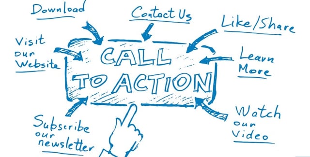
What is a CTA?

A CTA is a call-to-action. You’re welcome.
Just kidding! Sort of. There’s obviously a lot more you need to know about calls-to-action. Like what they are, what purpose they serve, and what it takes to create a successful one. Utilizing CTAs is the first step to a successful inbound marketing campaign. So let’s jump in!
What They Are
A call-to-action is a button promoting an offer, placed somewhere on your website that is linked to a landing page. Looks something like this:

What Purpose They Serve
Once the visitor is led to that landing page, they fill out a form to receive whatever offer your CTA promised, such as a downloadable e-book or a reservation to a webinar. By filling out the form, the person who was just considered a visitor is converted into a lead who is now one step closer to becoming a paying customer. After submitting the form, the lead is sent to a thank-you page, where they can receive the offer you guaranteed them. A CTA is the first step to this conversion process.
What it Takes to Create a Successful One
A CTA is a pretty simple button; however, there are a few ways to make sure it’s being optimized to its fullest. Consider these tips:
- Use action-oriented verbs. Instead of creating a button that says “Back-to-School Checklist”, make sure to use verbs such as “download”, “click here”, “sign up” or “register” that encourages visitors to take immediate action.
- Use keywords that spell out the offer. Make sure the viewer understands what you are offering. Just like “Back-to-School Checklist” isn’t enough, neither is “Click Here to Download”. Rather, both components are necessary for an effective CTA.
- Keep your message brief. The CTA should not be the main focus on your page, and it should be concise and easy to understand.
- Make the CTA attention-grabbing. Use colors, fonts and design to make your call-to-action stand out. Make sure that it is easily recognized as clickable. You can also use a picture or hyperlinked text. Make sure it pops!
- Consider page placement. Depending on what kind of page the CTA is being displayed, you will want to consider where the CTA is placed. In some cases, the CTA may be most effective by being placed above the fold (before a visitor needs to scroll down the page), but in other instances, such as a blog post, the CTA may perform better on the bottom of the page, where the reader will want to take further action. A sidebar is also a good place for a call-to-action. You can also include a CTA in emails - consider whether placing an email CTA on the top, bottom, middle or side of the text will lead to a higher click rate.
- Take your buyer persona into account (read about buyer personas here). What does your target audience want to see? Maybe they will be more drawn to a big, bold CTA, or perhaps they may be attracted to something more simple.
- Test it out. Try making small changes, such as font type, button size or CTA placement, to see what increases the click-through rate. Remember to make one change at a time, so you can clearly measure what change is making the difference.
So that’s it for call-to-actions. Let us know if you try any of these tips, and how they pay off! Coming soon: posts on landing pages and thank-you pages so that you can go on to the next steps of the conversion process.
(See what we did there?)
Your Articles Need SkimCatchables
Skim-Catchables are bloggers' - now- not-so- secret weapon to make readers' jobs easier because they can easily skim down a page and find the answer to what they are looking for. Engaging titles and subtitles, gorgeous infographics, and functions like TL; DR (Too long; didn’t’ read) not only help readers, but should be part of any writer's tool kit!
TopicChaya Lencz is our marketing associate at AbilitySEO. In addition, she is currently a student at University of Baltimore's Merrick School of Business.


Leave us
a Comment!